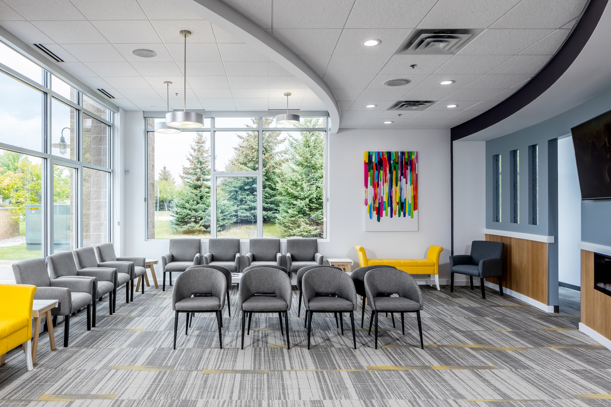
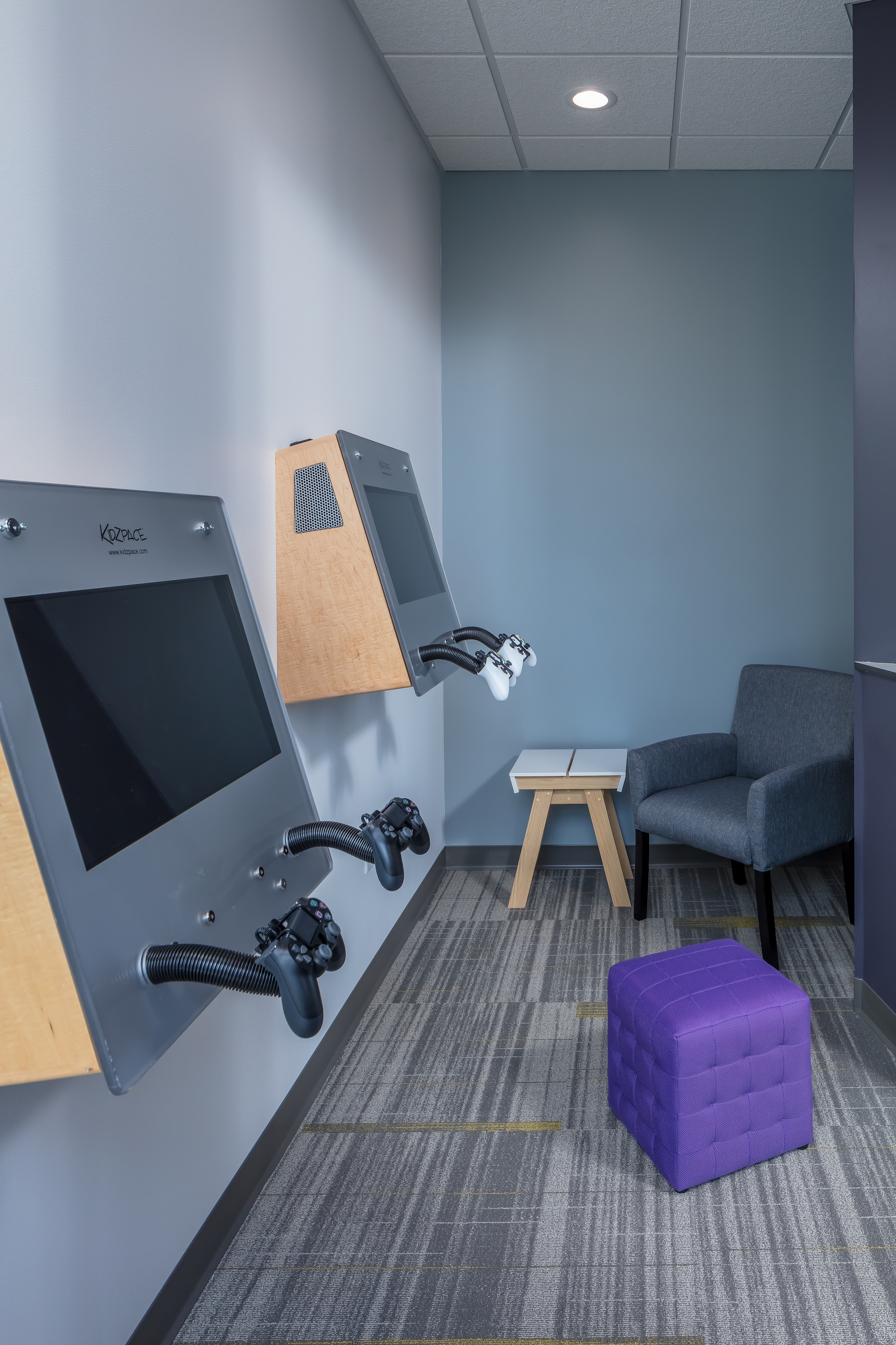
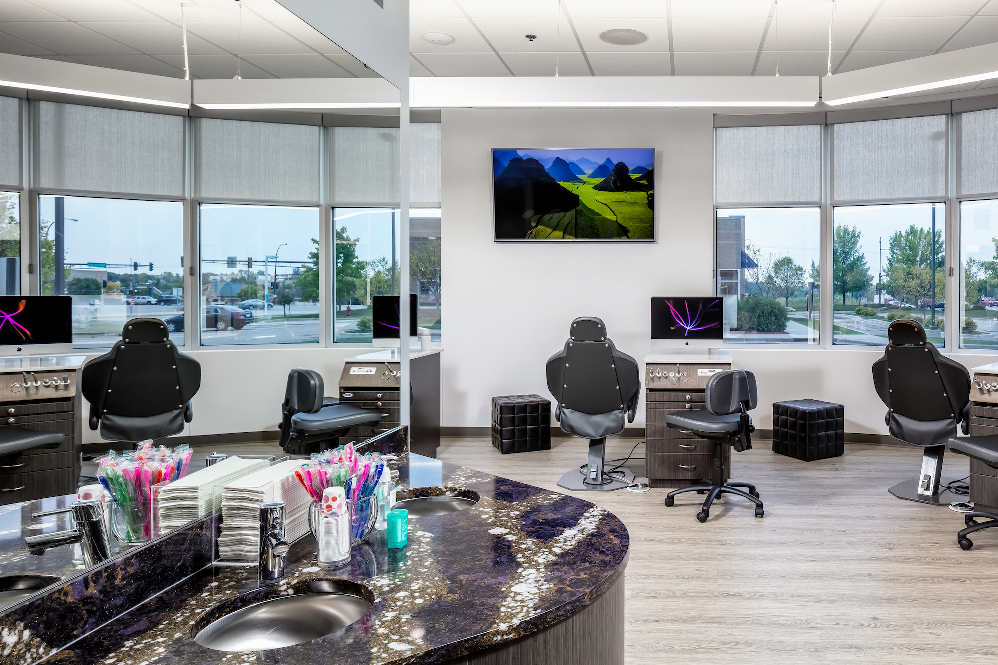
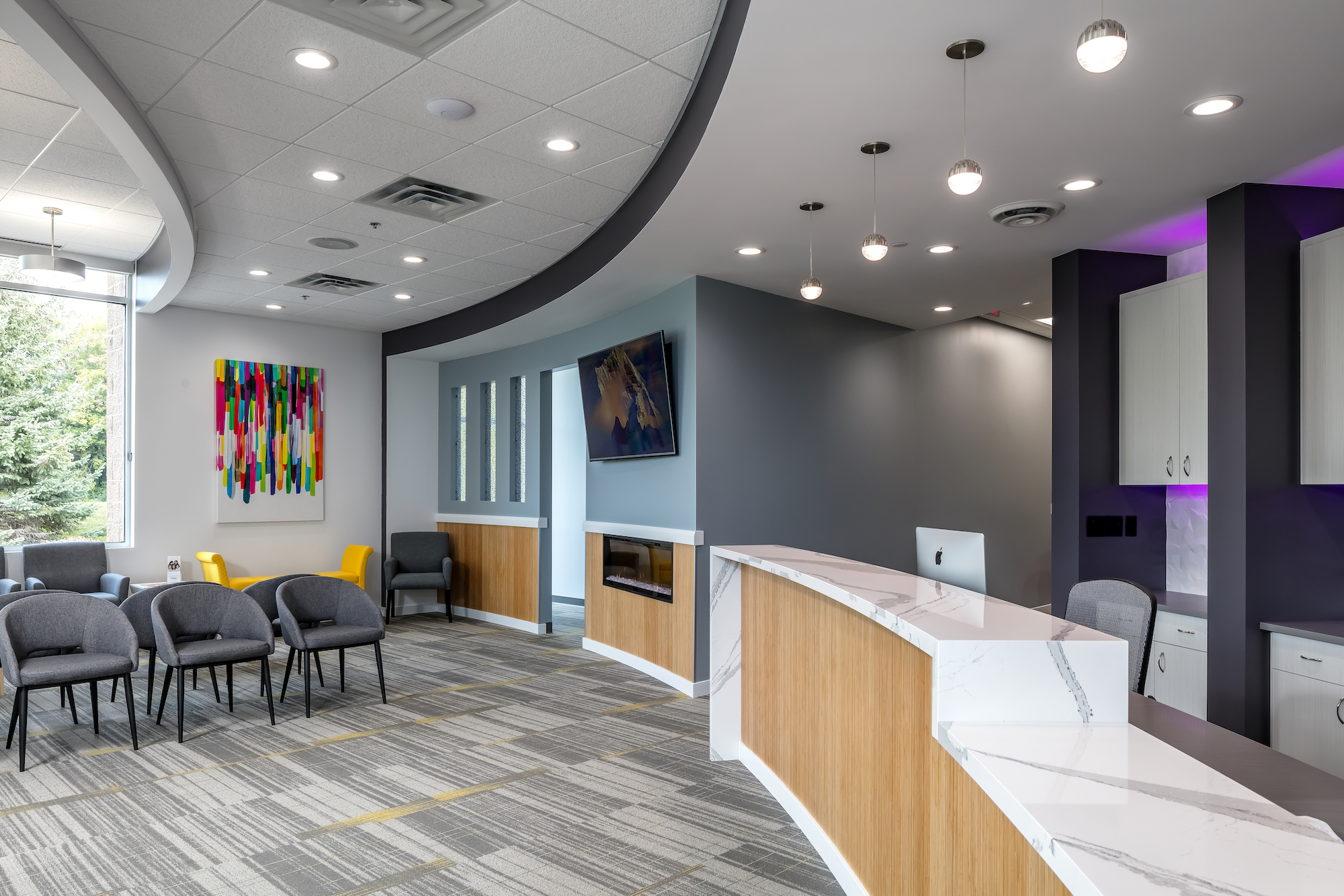
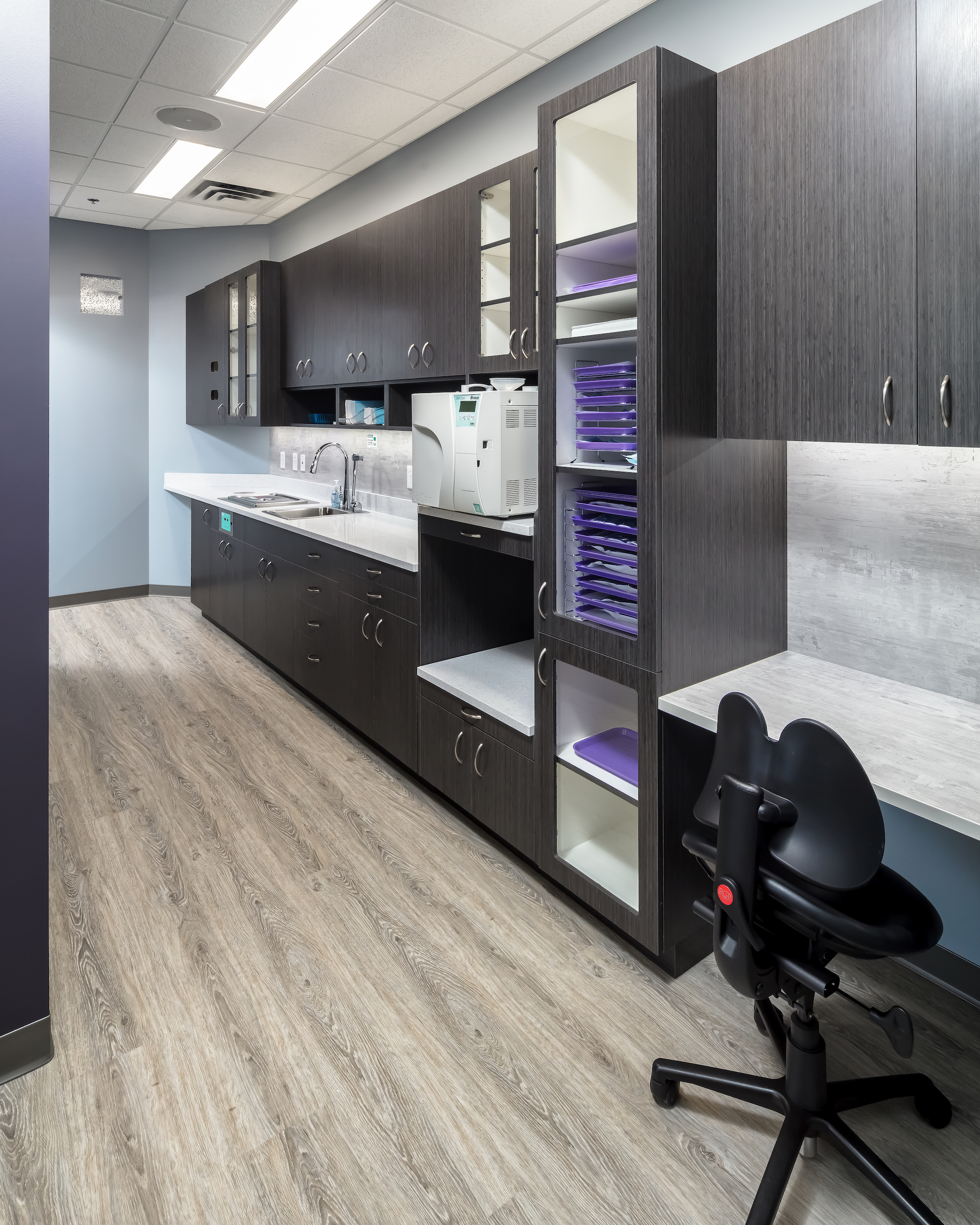
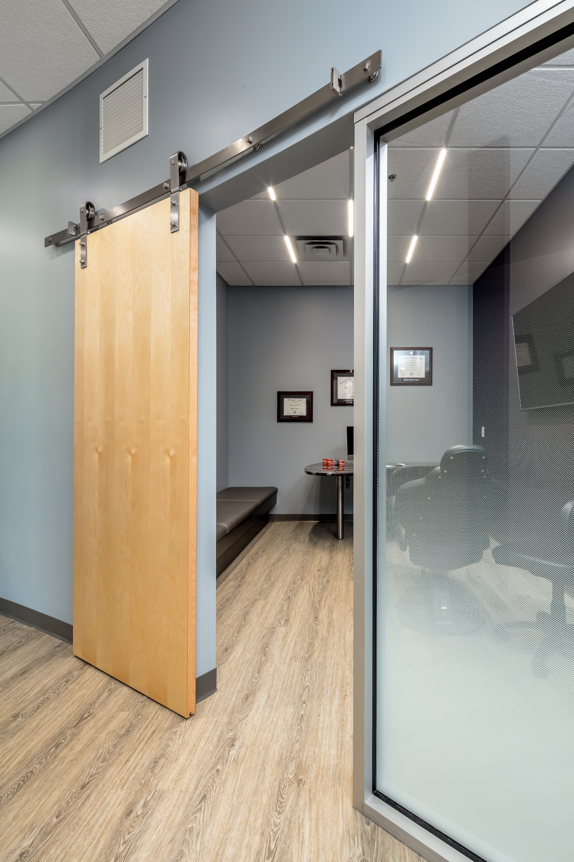
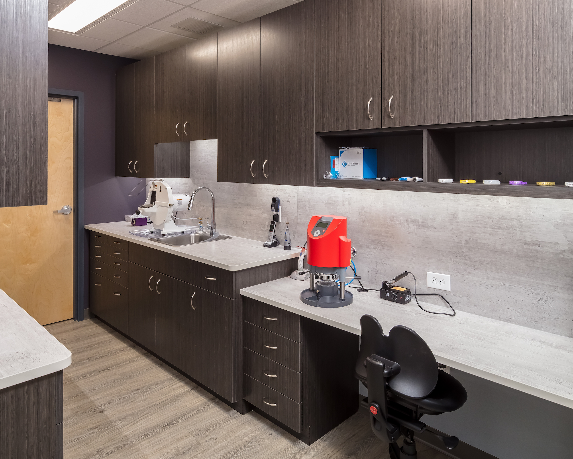
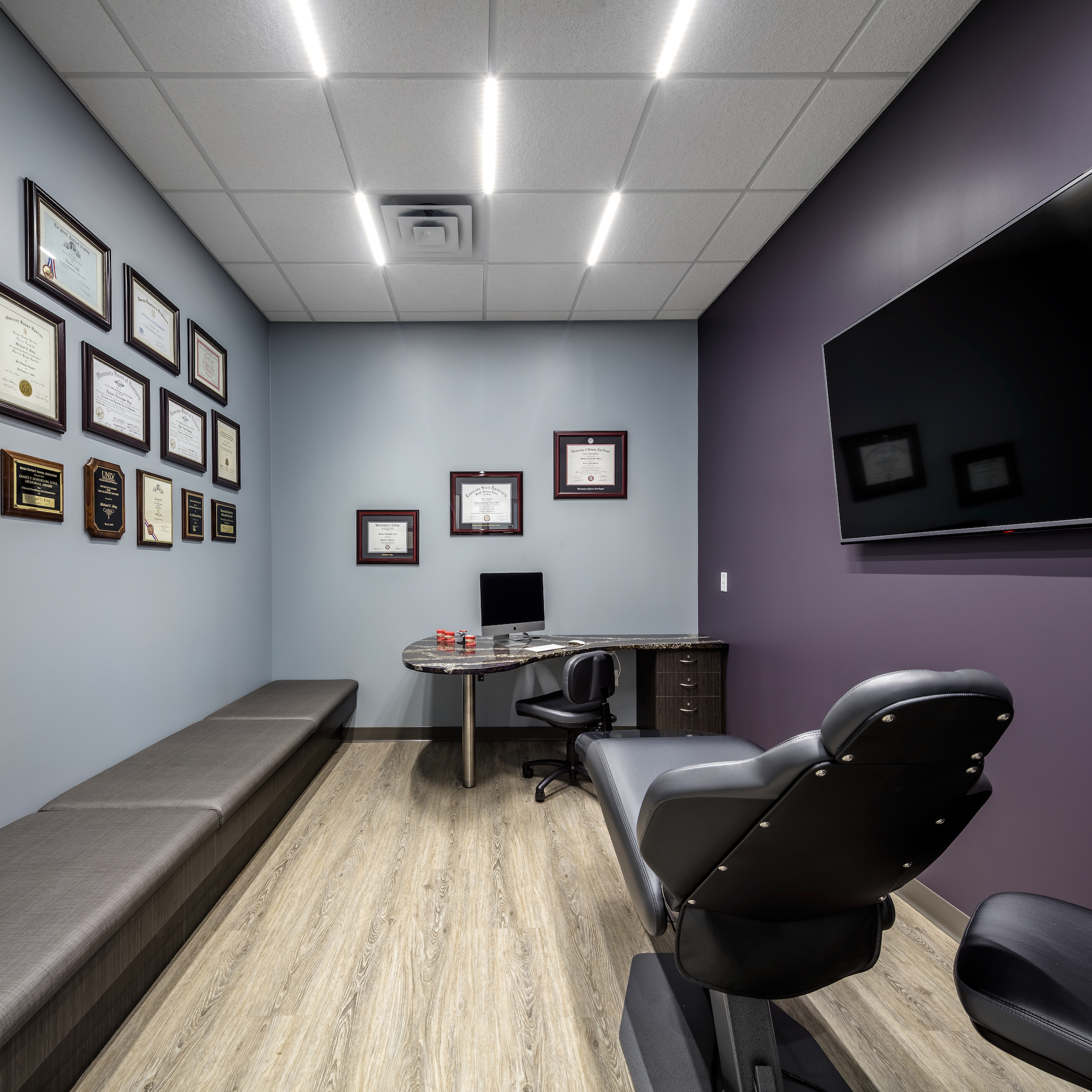
From our first conversation with Dr. King, we imagined a multi-layered orthodontics clinic. The layered, yet open flow from reception to treatment almost hugs the patients as they move through. The layering of adult sophistication with youthful enthusiasm in the design flows from waiting area, to imaging, to consultation, all the way to the treatment area. The color scheme is a very sophisticated reflection of the logo colors of the Minnesota Vikings that is represented in various ways, while not being noticeably “purple and gold”.
Client: www.michaelkingortho.com
Contractor: Karkela Construction
