
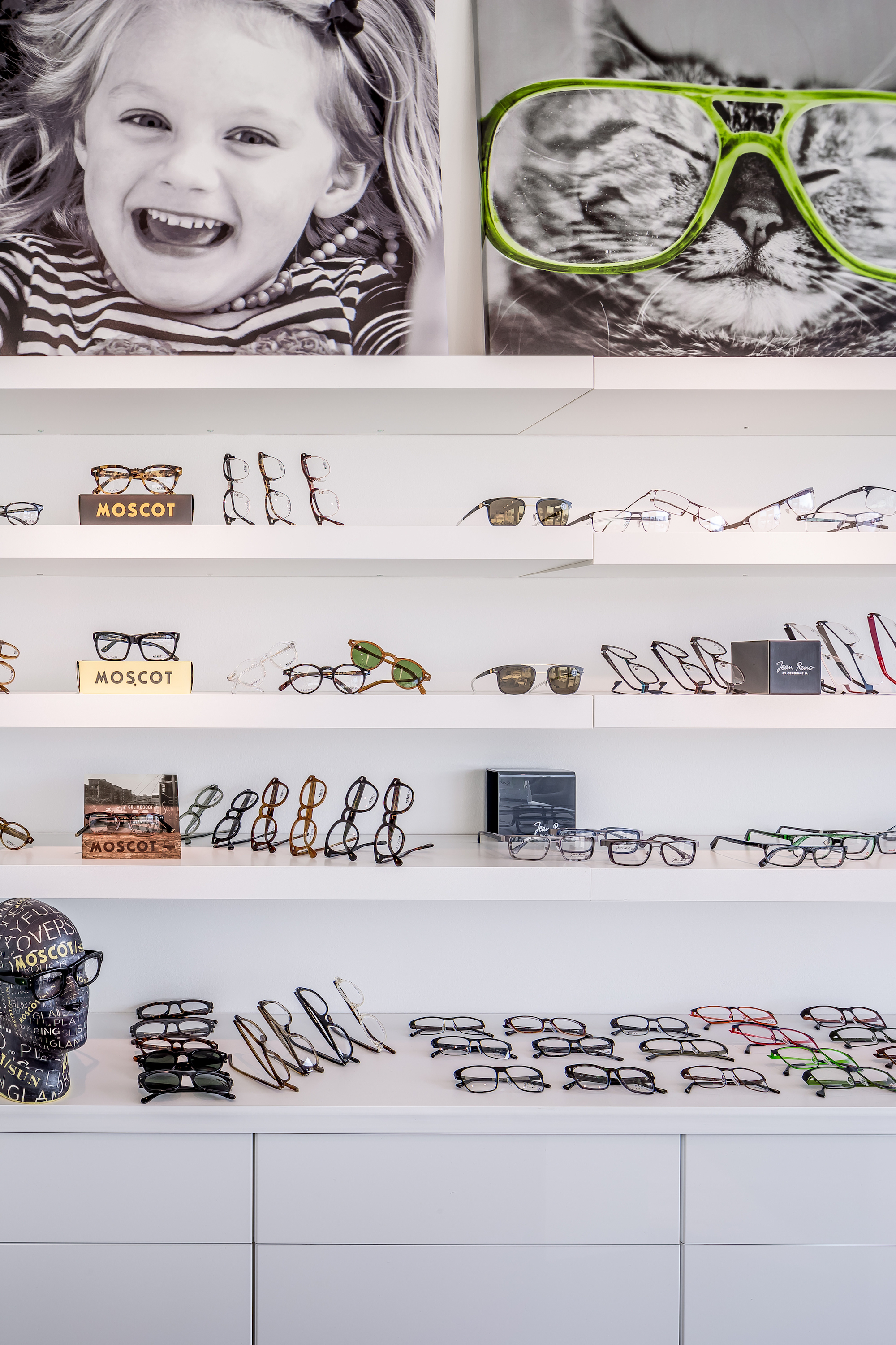
Recently awarded for its unique design, this optometry clinic uses custom graphics to create a pop art variation to their logo to draw attention. The chartreuse color is a certain wavelength defined by the optometrist to provide scientifically-tested comfort to the patients and customers. This color represents enthusiasm, happiness, nature, growth, and youth. This design is very reflective of the doctor’s directives to make this a modern, and very family friendly environment.


Client: www.winkfamilyeyecare.com
Contractor: Karkela Construction